Why is the Bootstrap grid system 12 columns wide?

Bootstrap’s 12 column layout
Have you ever wondered why Bootstrap, the popular JavaScript framework designed to create responsive web pages, uses a 12-column grid system?
After all, the entire civilized world uses the metric system. Would not a base-10 Bootstrap grid layout system for rows and columns make more logical sense?

Bootstrap 5 continues to use the 12-column grid system pioneered in earlier versions.
Actually, it wouldn’t. And math is the reason why.
Why does Bootstrap use 12 columns?
Bootstrap uses a 12-column layout because the number 12 has more divisors than any number before it or after it, up until the number 60.
With Bootstrap’s 12-column layout, responsive webpages can be divided up six different ways:
- Halves (12/6)
- Thirds (12/4)
- Quarters (12/3)
- Sixths (12/2)
- Twelves (12/12)
- and a single unit (12/1)
That’s not possible with the numbers like 10, 20 or 30.
The need for a responsive webpage to be evenly divided in multiple ways as the viewport of a device changes, is why Bootstrap chose a 12-column layout.
Highly composite numbers
In mathematics, the number 12 is known as a superior highly composite number. Along with the numbers 2, 6 and 60, 12 is only one of four superior highly composite numbers below the threshold of 100.
Being highly composite means you can divide a number evenly in many ways — specifically, more ways than any positive whole number that precedes it.
This divisibility is important in responsive web page design.
Responsive rendering
When Bootstrap renders a webpage, the JavaScript framework assesses the size of the viewport. A desktop is bigger than a tablet, and a tablet’s viewport is bigger than that of a smartphone.
Bootstrap then decides whether to lay all of the content across the page from left to right, or to chop up the content to accommodate different devices’ viewing windows, i.e. into halves or thirds or quarters.
This responsive rendering generates a webpage that effectively uses every pixel on a 4K monitor, but also renders equally handsomely on a medium-sized Android tablet or even the much smaller iPhone 12 mini.
This same logic is behind why Tim Hortons sells donuts by the dozen and not 10 at a time. You can split a dozen donuts evenly between 2, 3, 4, 6 or 12 of your friends. You can’t do that with a 10-pack.
Bagels, hours and circles
The explanation as to why the 12-column Bootstrap grid exists also answers other meta-physical questions we often ask ourselves:
- Why are there 12 pennies in a shilling?
- Why does an hour have 60 minutes?
- Why are there 360 degrees in a circle?
- Why did Plato’s perfect city have 5,040 residents?
Multiple divisors
Like the number 12, the numbers 60, 360 and 5,040 are all superior highly composite numbers.
- The number 60 has 6 different divisors
- The number 60 has 12
- The number 360 has 24
- The number 5,040 has 60
So with hours being split into 60 minutes, you can be late to a Zoom call in 12 different ways!
In contrast, if there were 100 minutes in an hour, the number of even splits would only be 9.
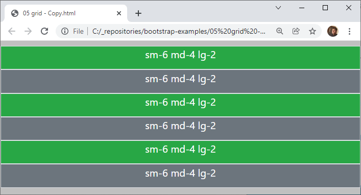
Bootstrap uses a 12-column grid system that can update itself responsively based on screen size.
Common composite numbers
There are only 38 highly composite numbers below the one million threshold, including 120, 2,520, 5,040, 55,440 and 720,720. Such numbers rarely elbow their way into our everyday vernacular.
However, the highly composite numbers of 12, 60 and 360 are pervasive in our lives, and the number 12 specifically plays a key role in modern, responsive web site design.
 Cameron McKenzie is an AWS Certified AI Practitioner, Machine Learning Engineer, Solutions Architect and author of many popular books in the software development and Cloud Computing space. His growing YouTube channel training devs in Java, Spring, AI and ML has well over 30,000 subscribers.